


United Arab Emirates
Creative / Art Direction, Brand Strategy, Brand Development, Branding, Brand identity, Brand Management, Packaging.
The transformation of Chicken Man marked an era of culinary excellence and creativity. The decision to revamp the rebranding was inspired by a sense of heroism.
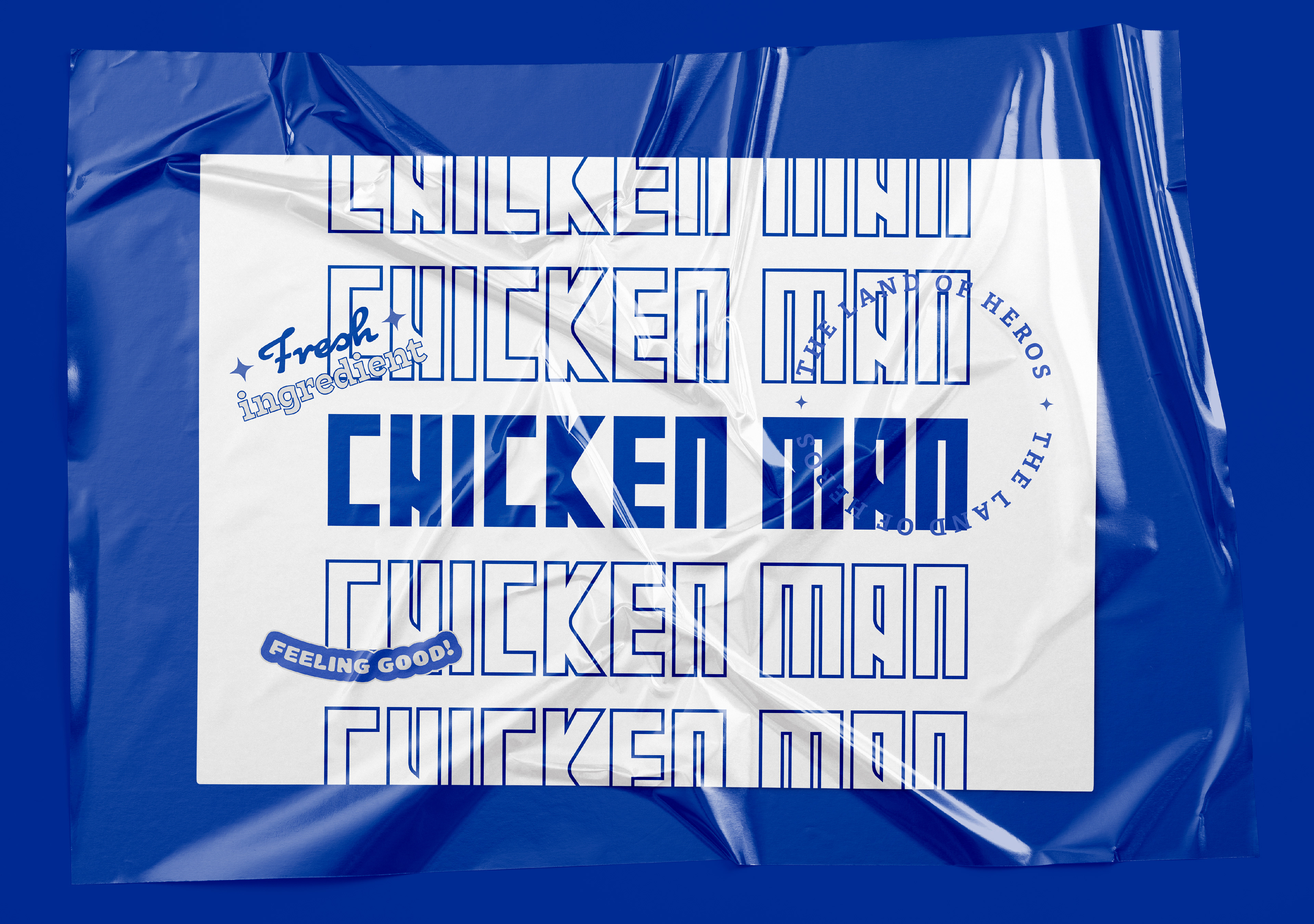
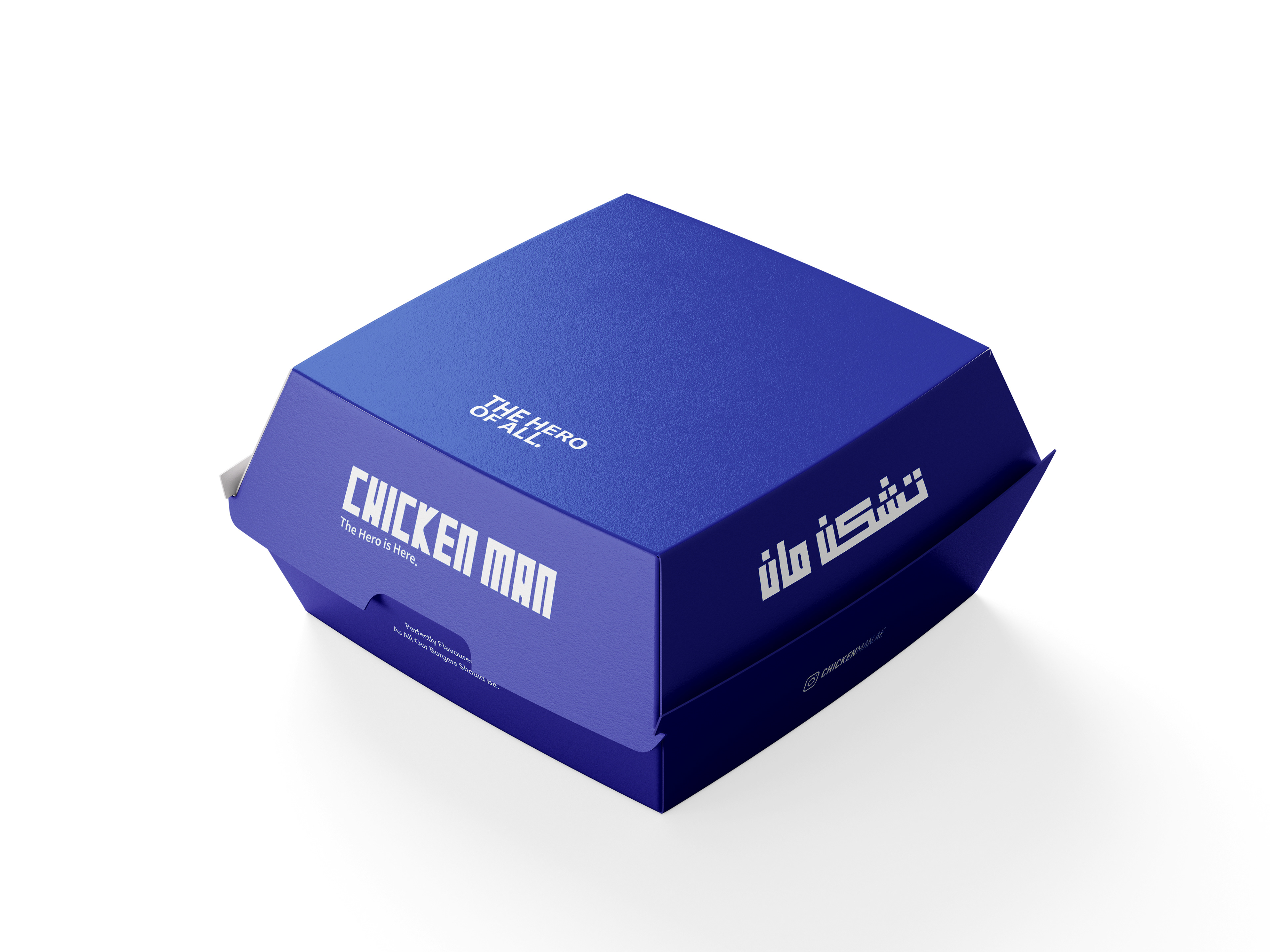
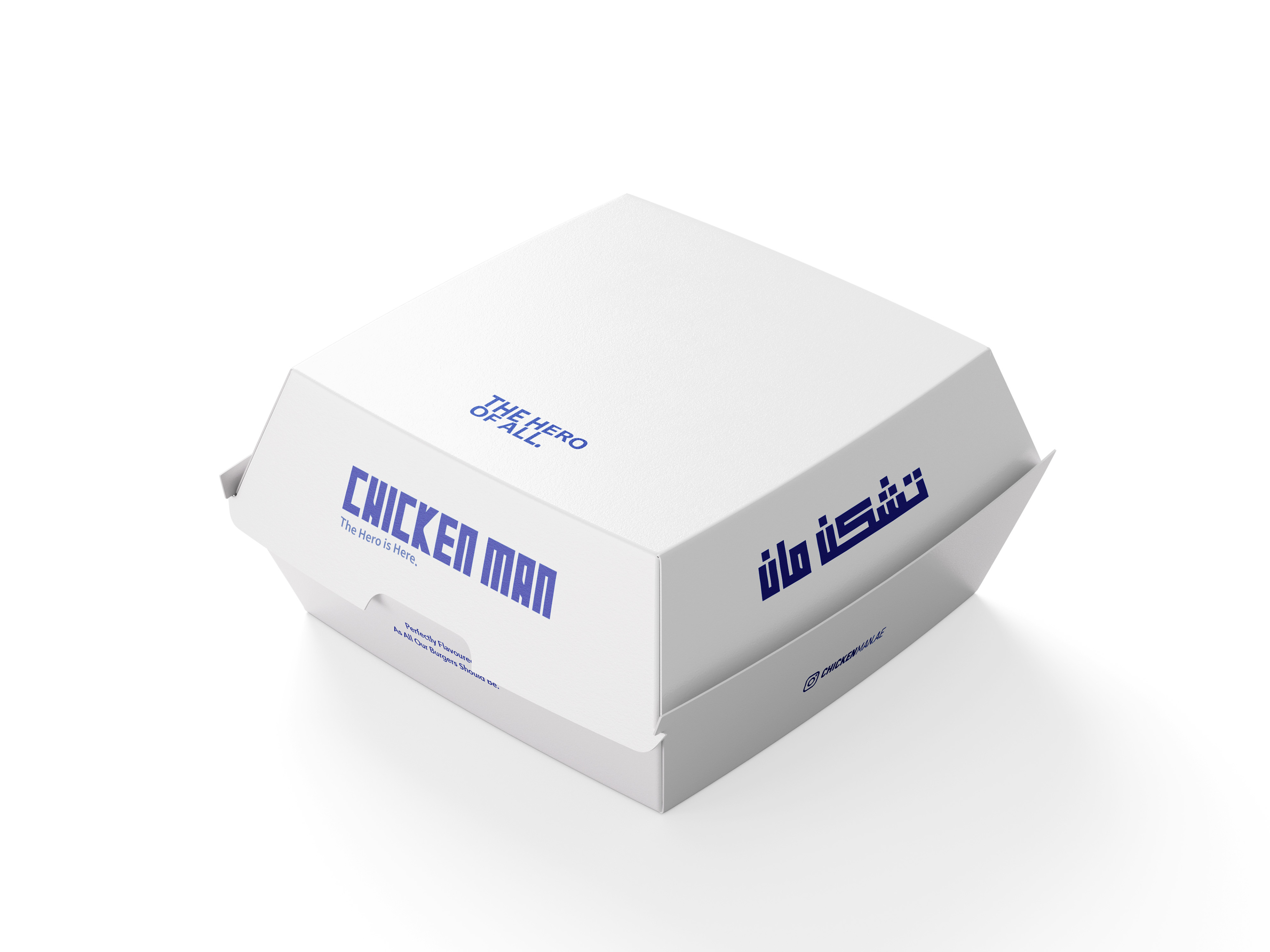
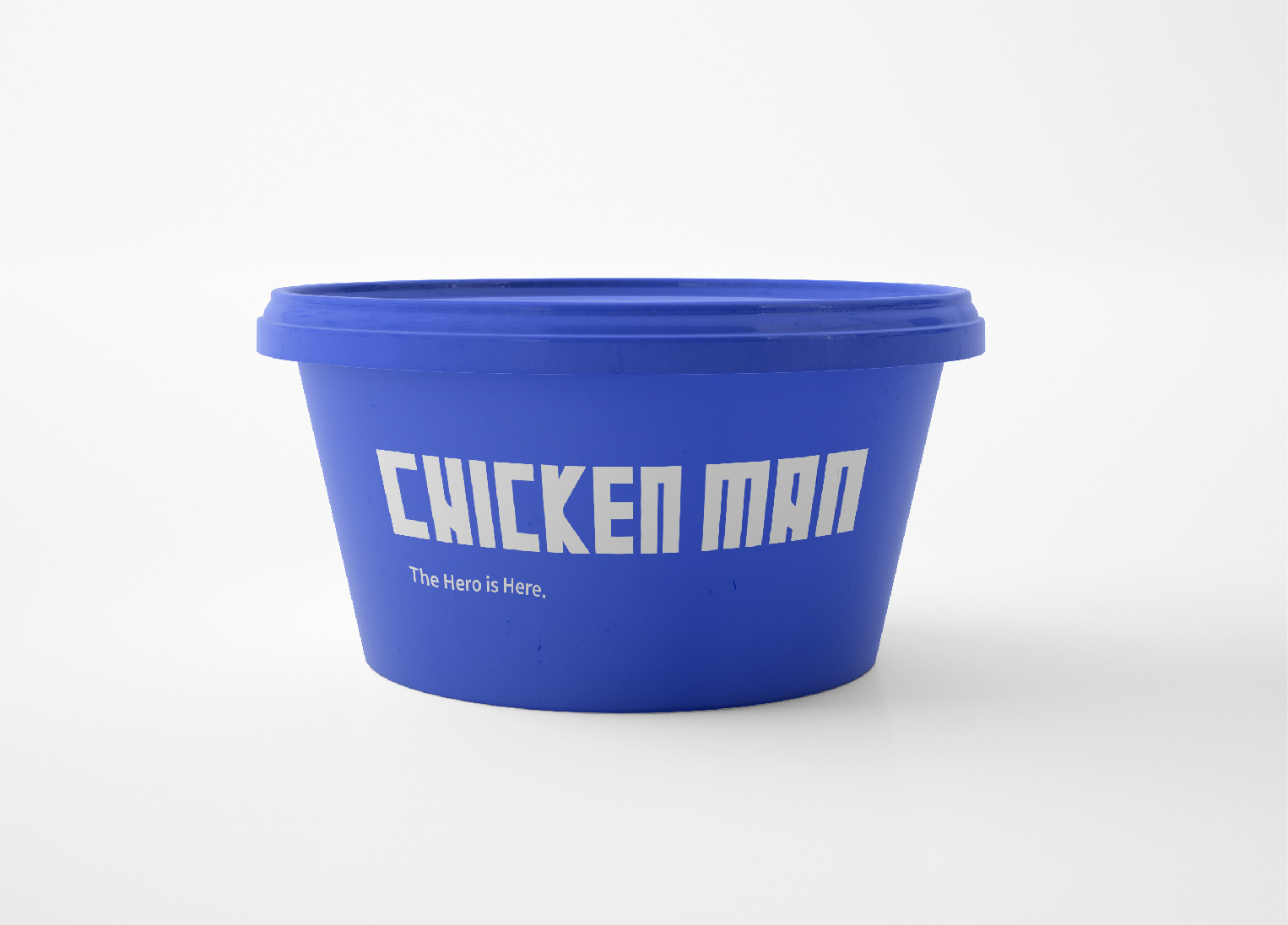
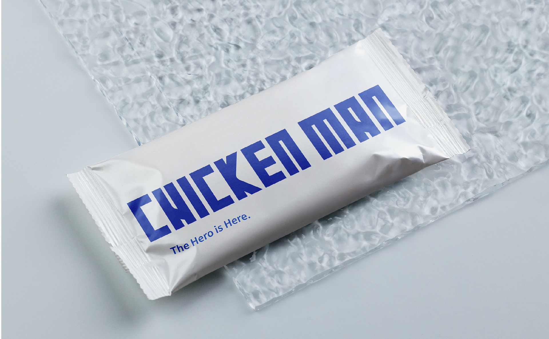
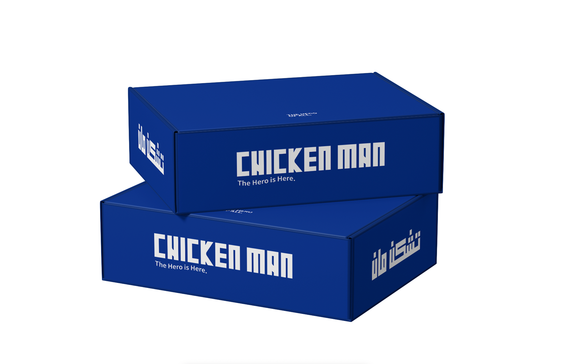
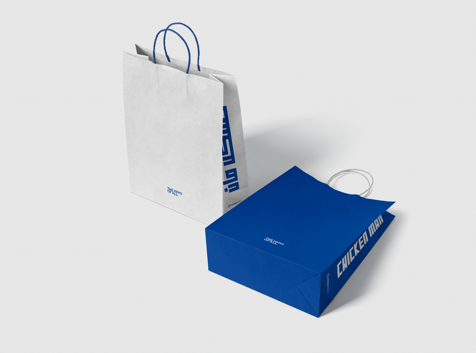
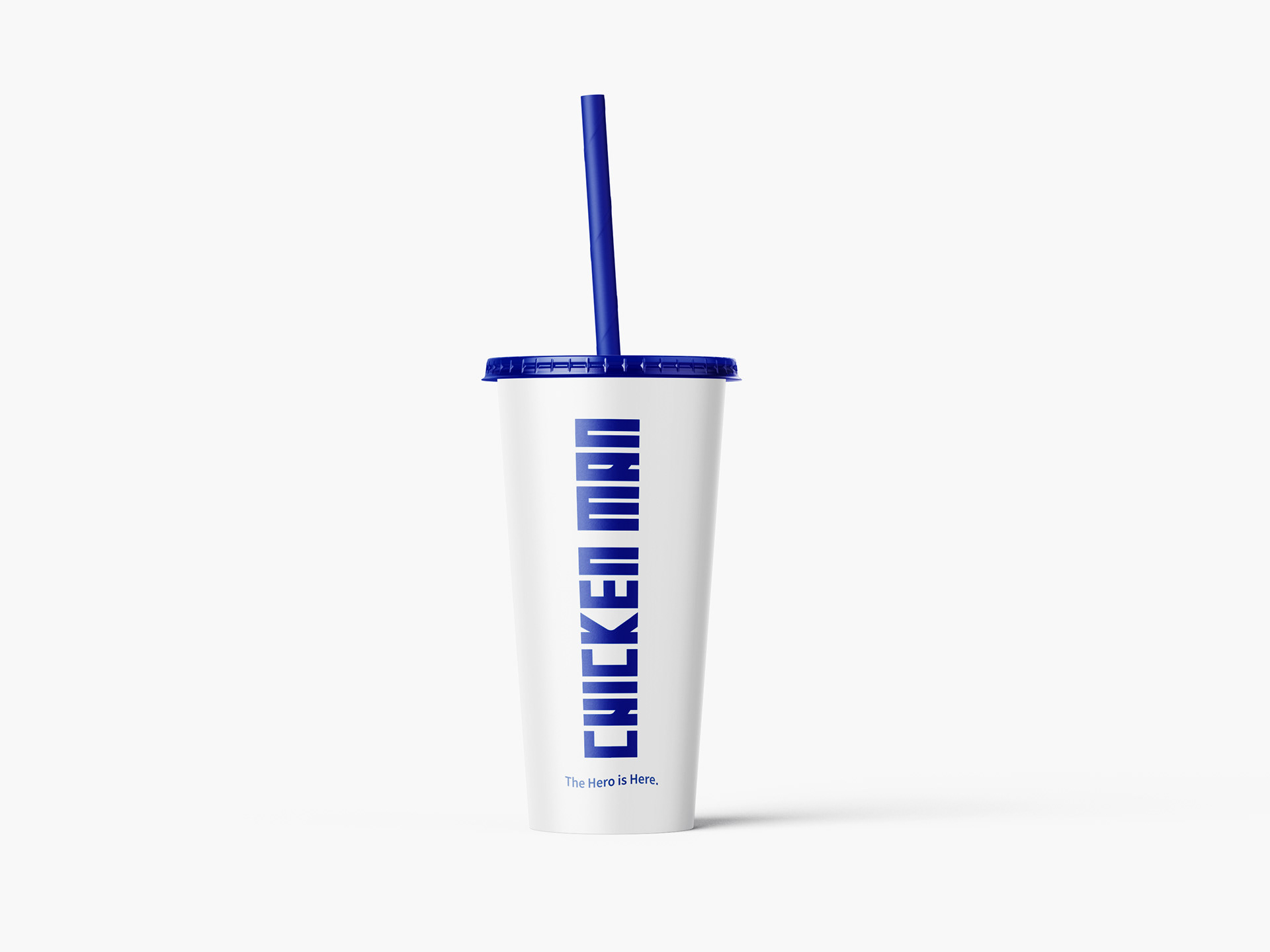
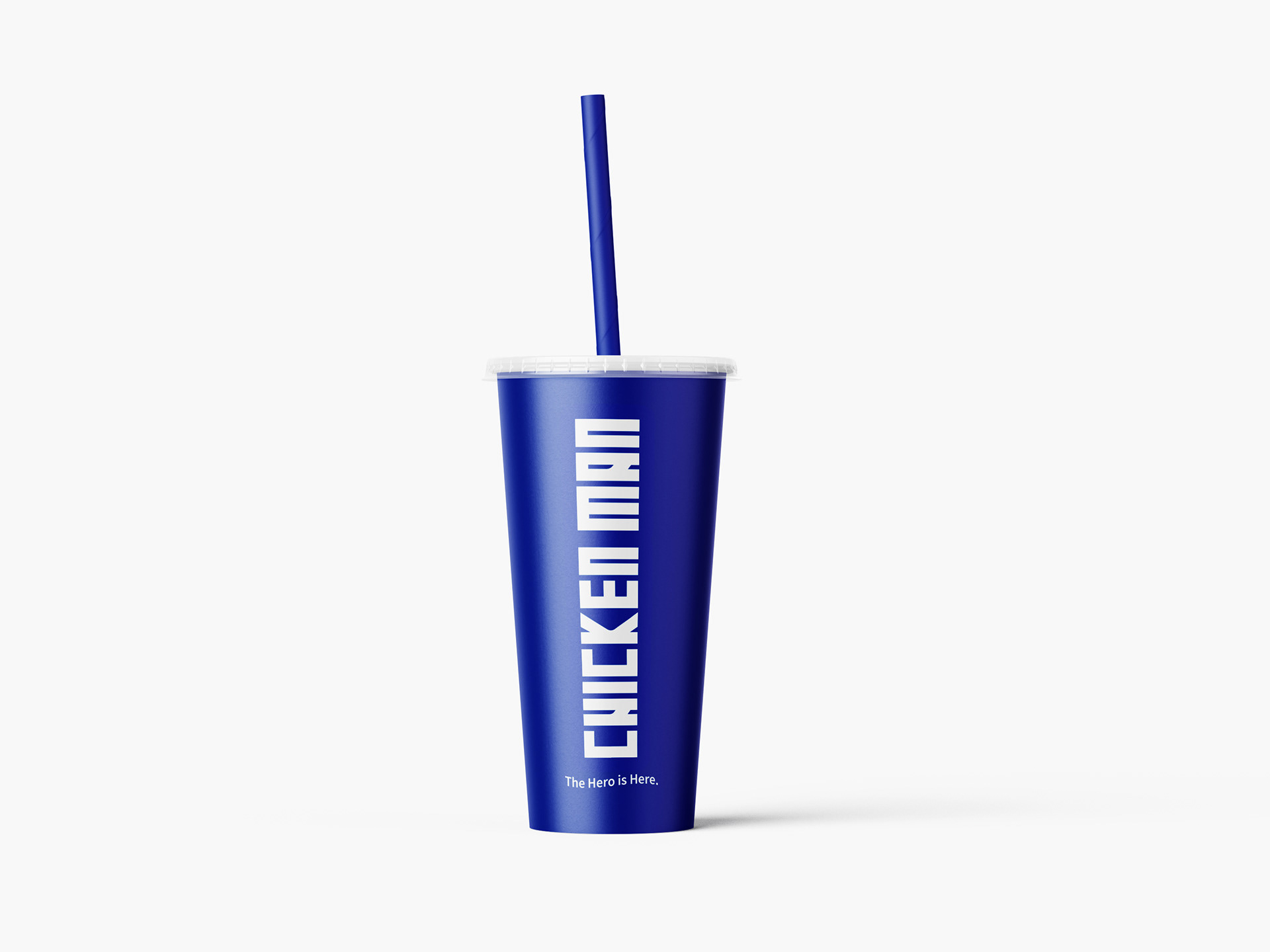
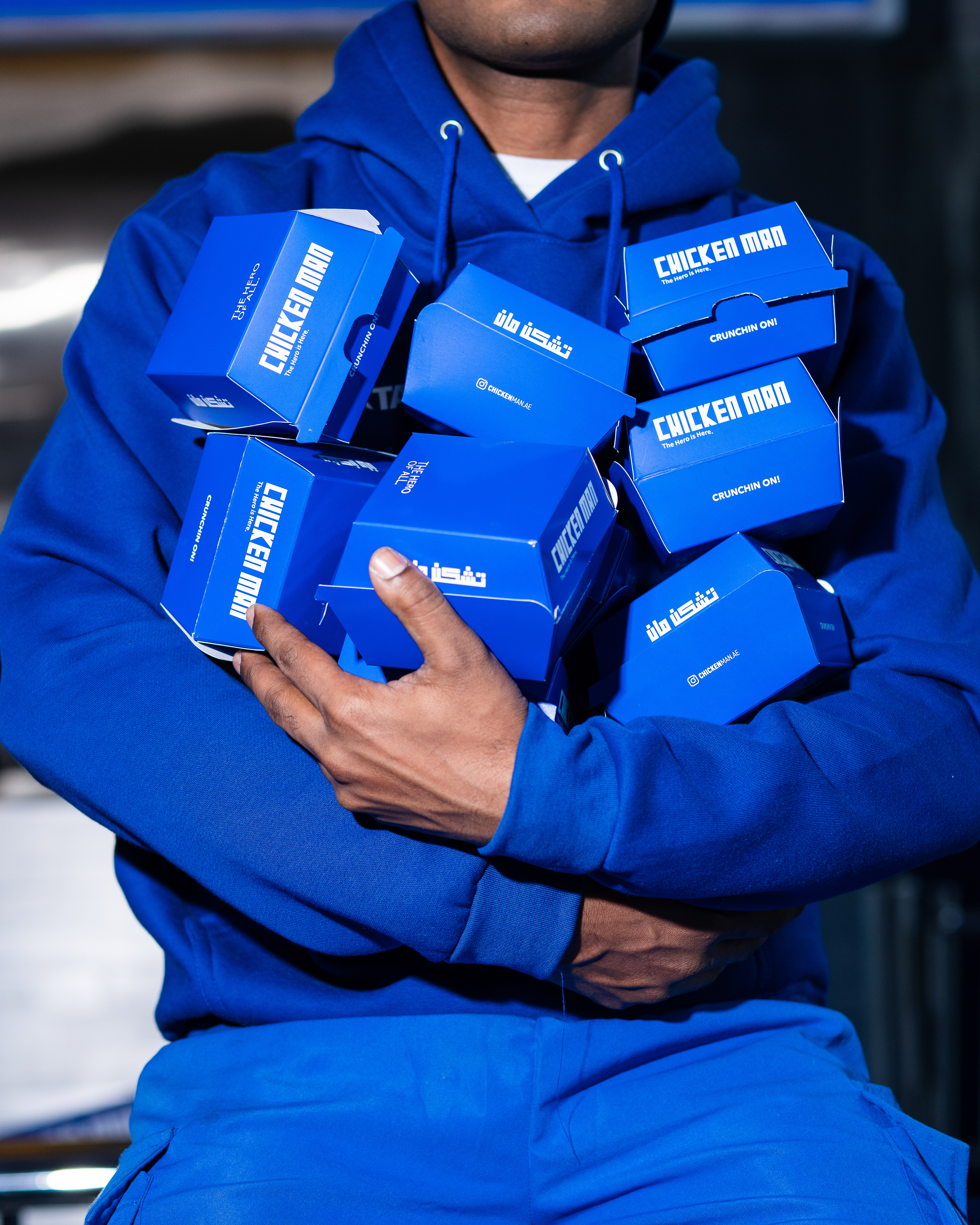
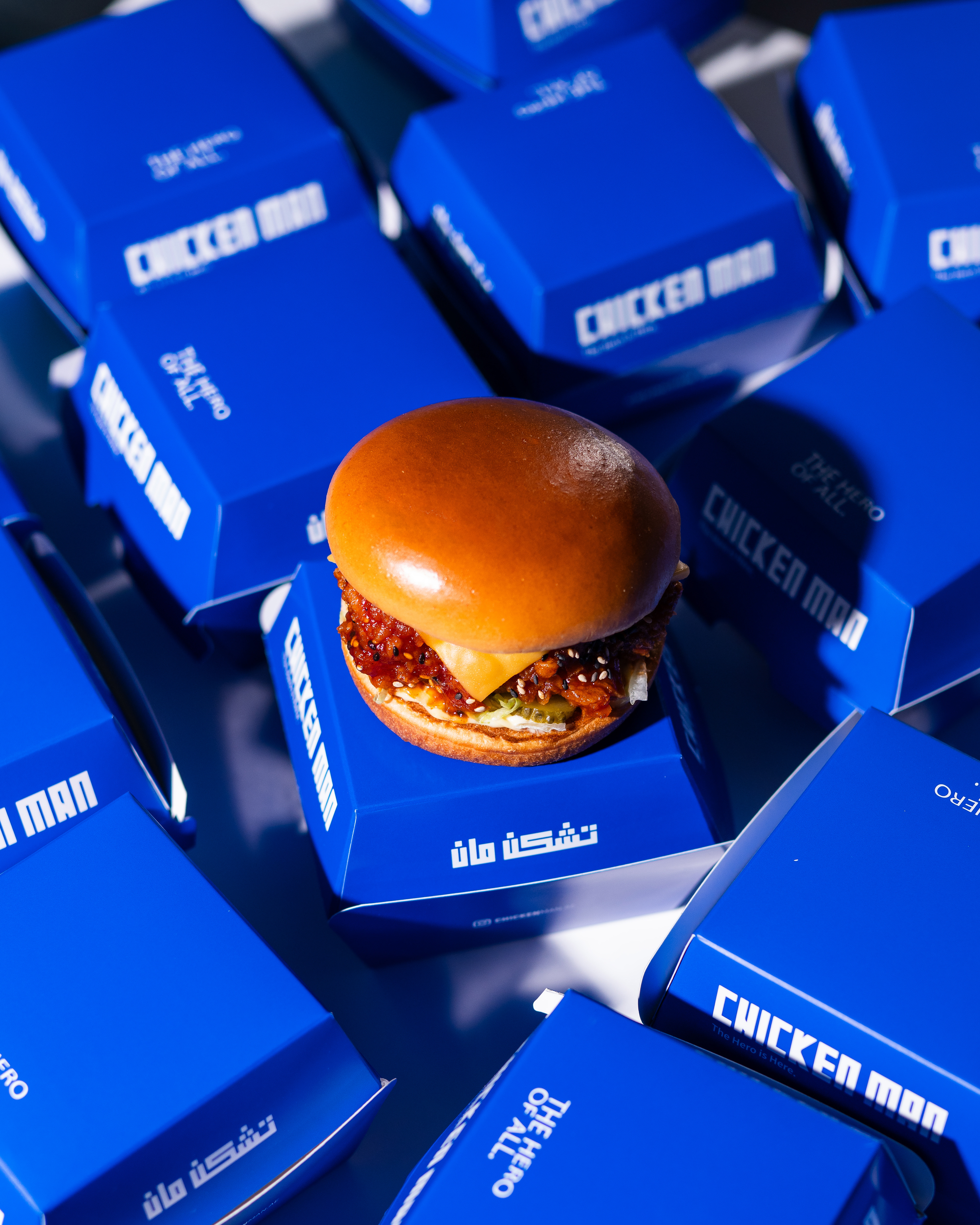
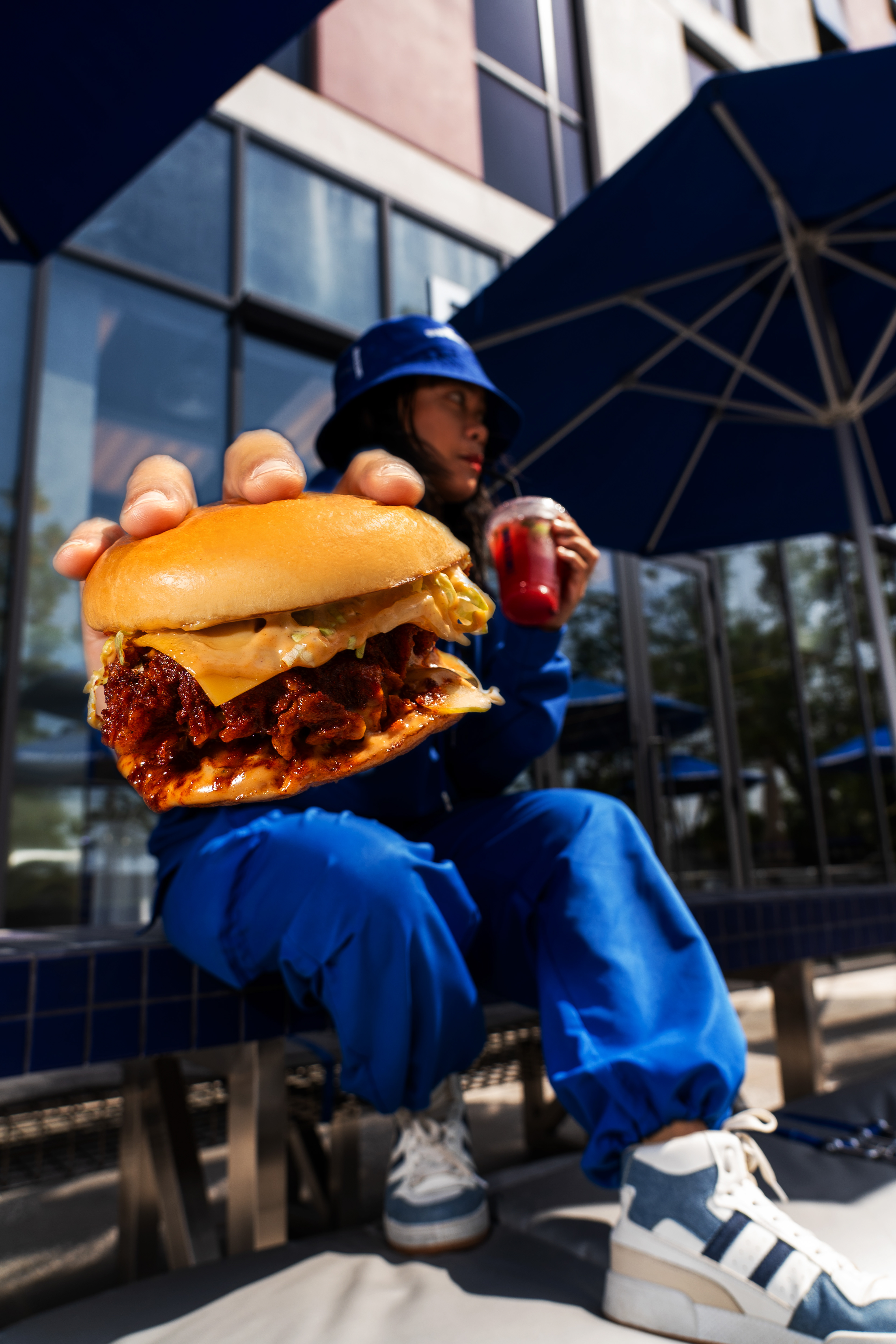
Drawing inspiration from the essence of heroism we set out on a daring mission to infuse the brand with vitality and dynamism. We introduced the captivating color blue as the point of our rebranding effort symbolizing resilience, assurance, and honesty. This vibrant hue acts as a representation of Chicken Man's values – bold, steadfast, and truly engaging.
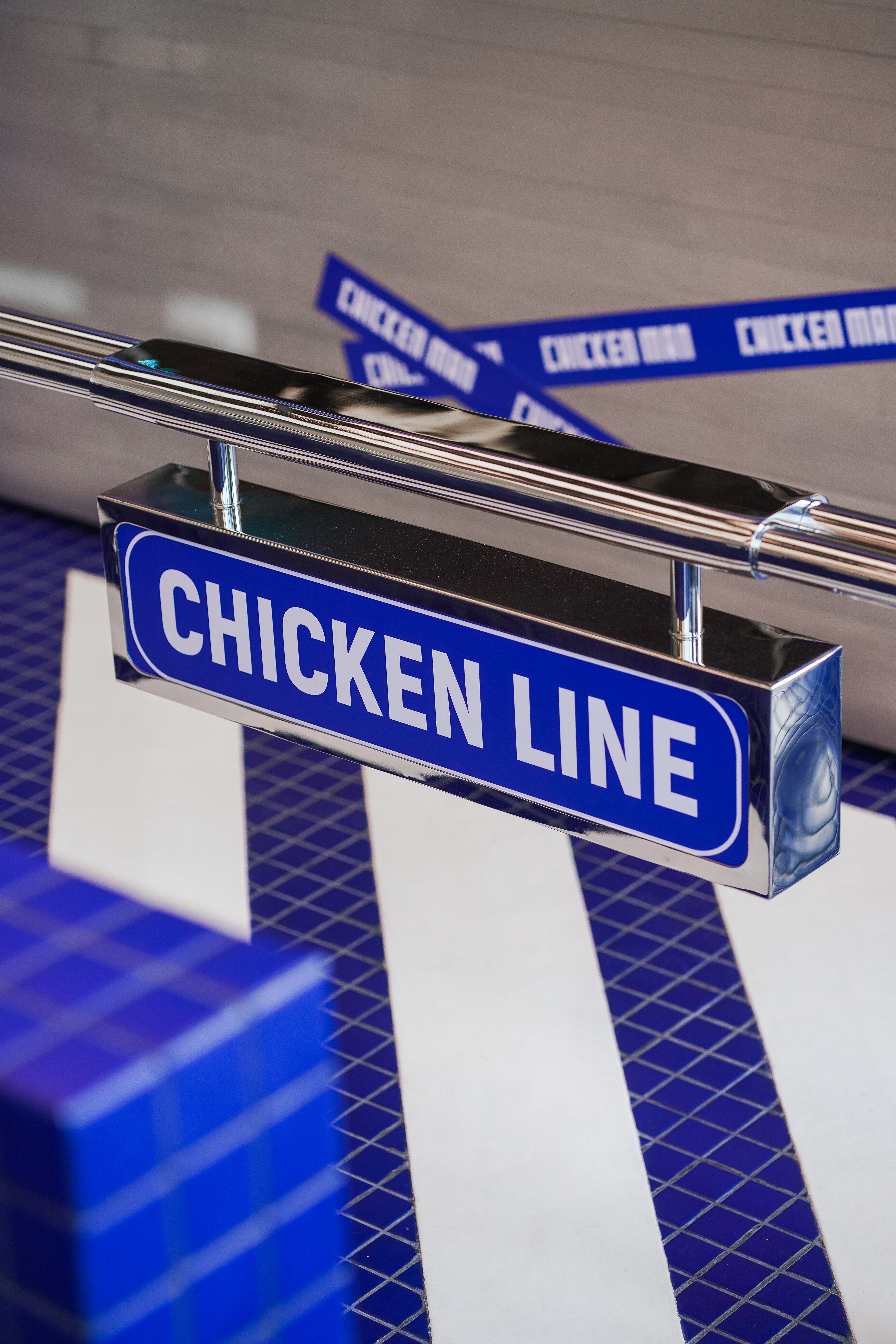
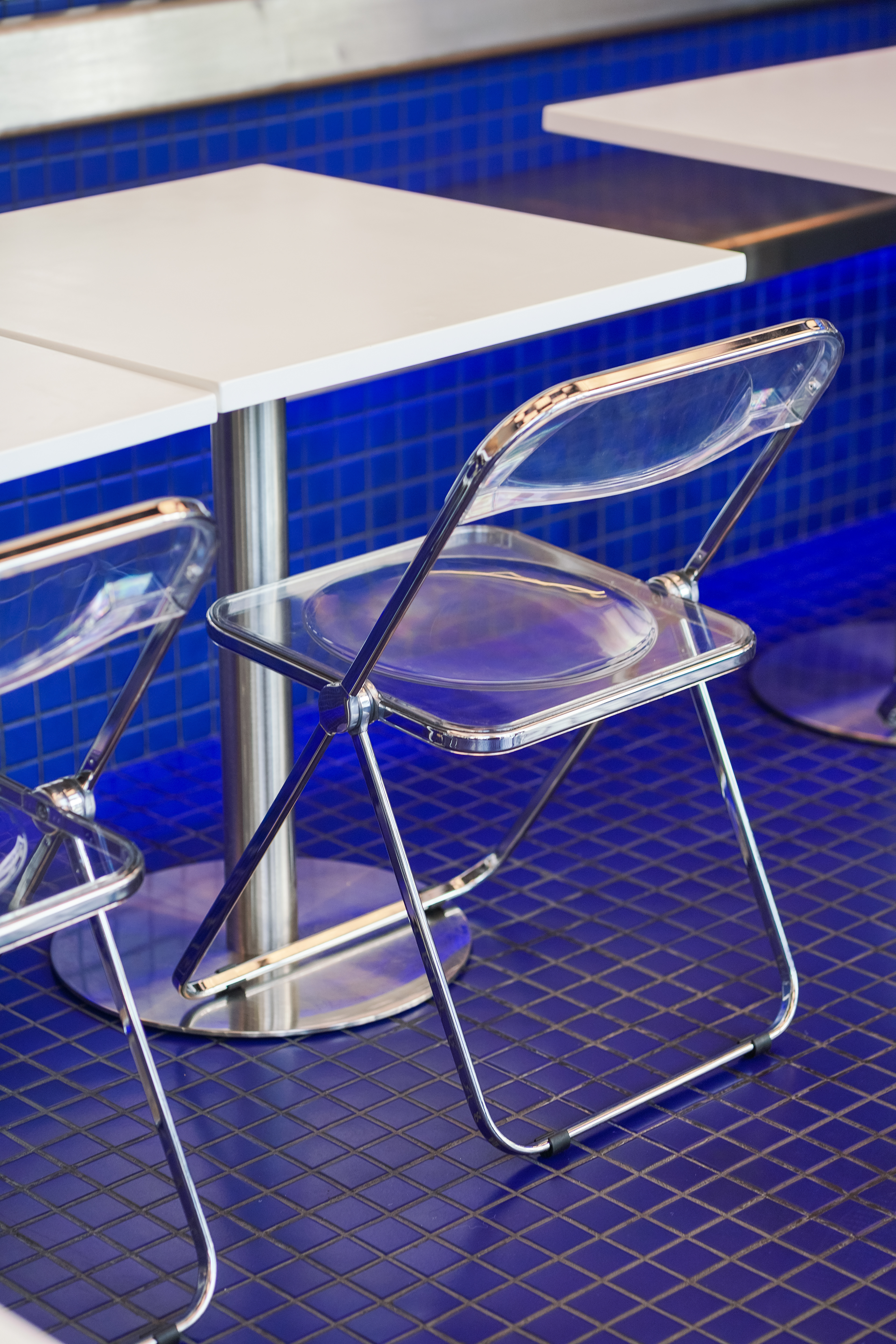
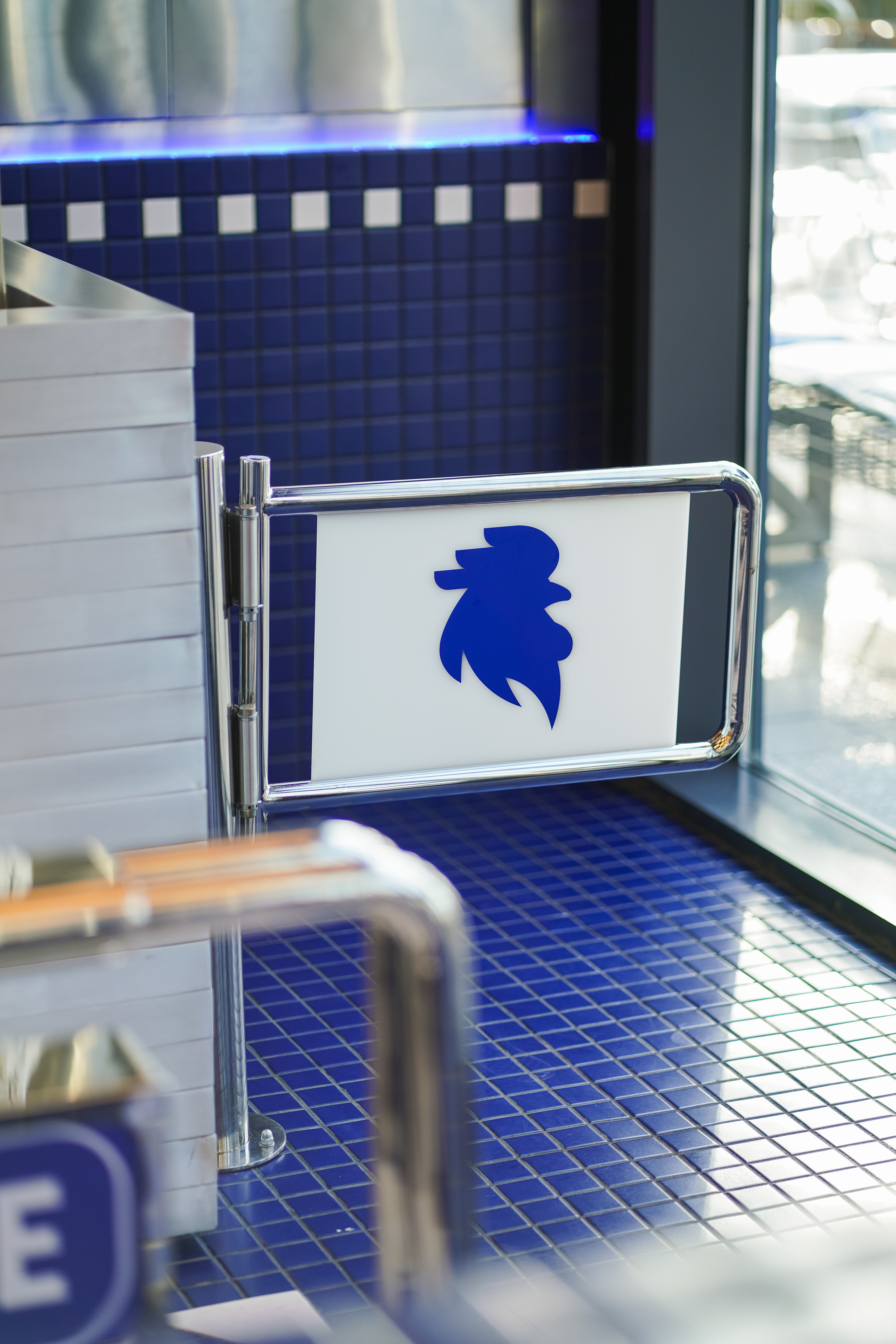
However, the journey towards rebranding went beyond changing the identity; it extended into every other aspect to experience an atmosphere brimming with vitality and enthusiasm. The interior design reflects the renewed identity, by blending elements of heroism with sophistication. From furnishings to artwork, every element pays tribute to the unbeatable spirit of everyday heroes.
Drawing inspiration from the essence of heroism we set out on a daring mission to infuse the brand with vitality and dynamism. We introduced the captivating color blue as the point of our rebranding effort symbolizing resilience, assurance, and honesty. This vibrant hue acts as a representation of Chicken Man's values – bold, steadfast, and truly engaging.
However, the journey towards rebranding went beyond changing the identity; it extended into every other aspect to experience an atmosphere brimming with vitality and enthusiasm. The interior design reflects the renewed identity, by blending elements of heroism with sophistication. From furnishings to artwork, every element pays tribute to the unbeatable spirit of everyday heroes.
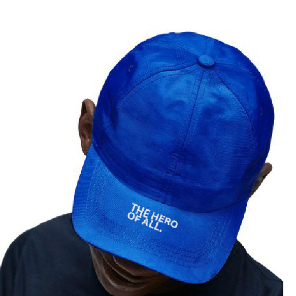
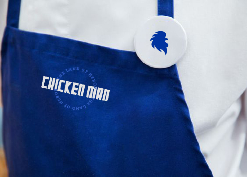
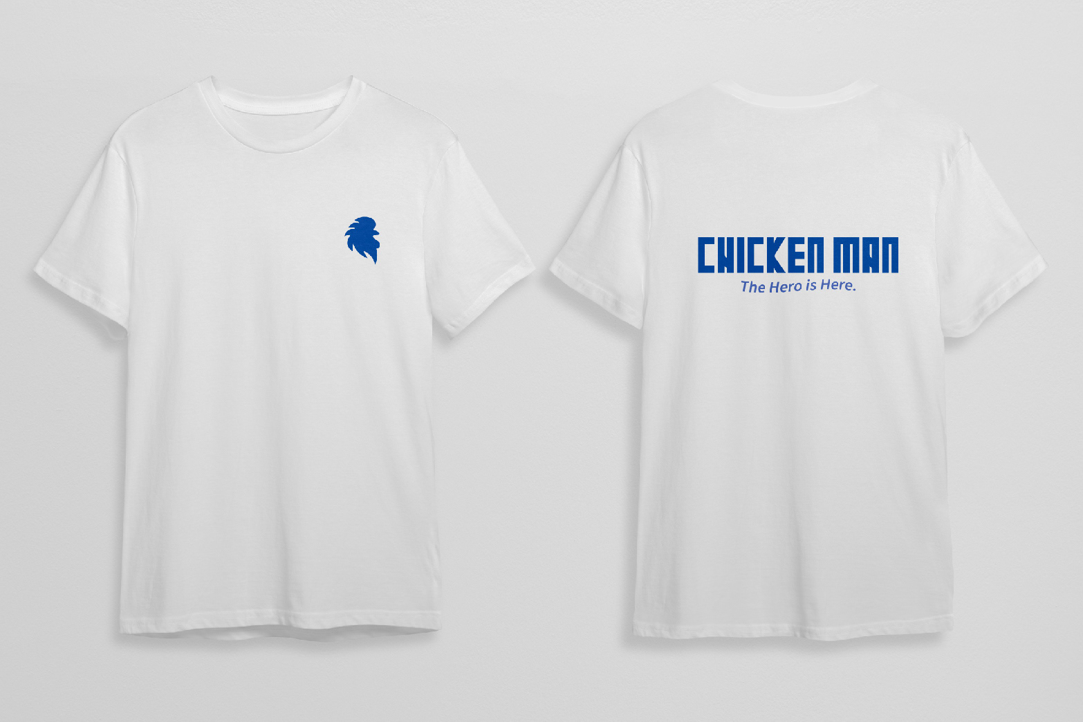
Uniform
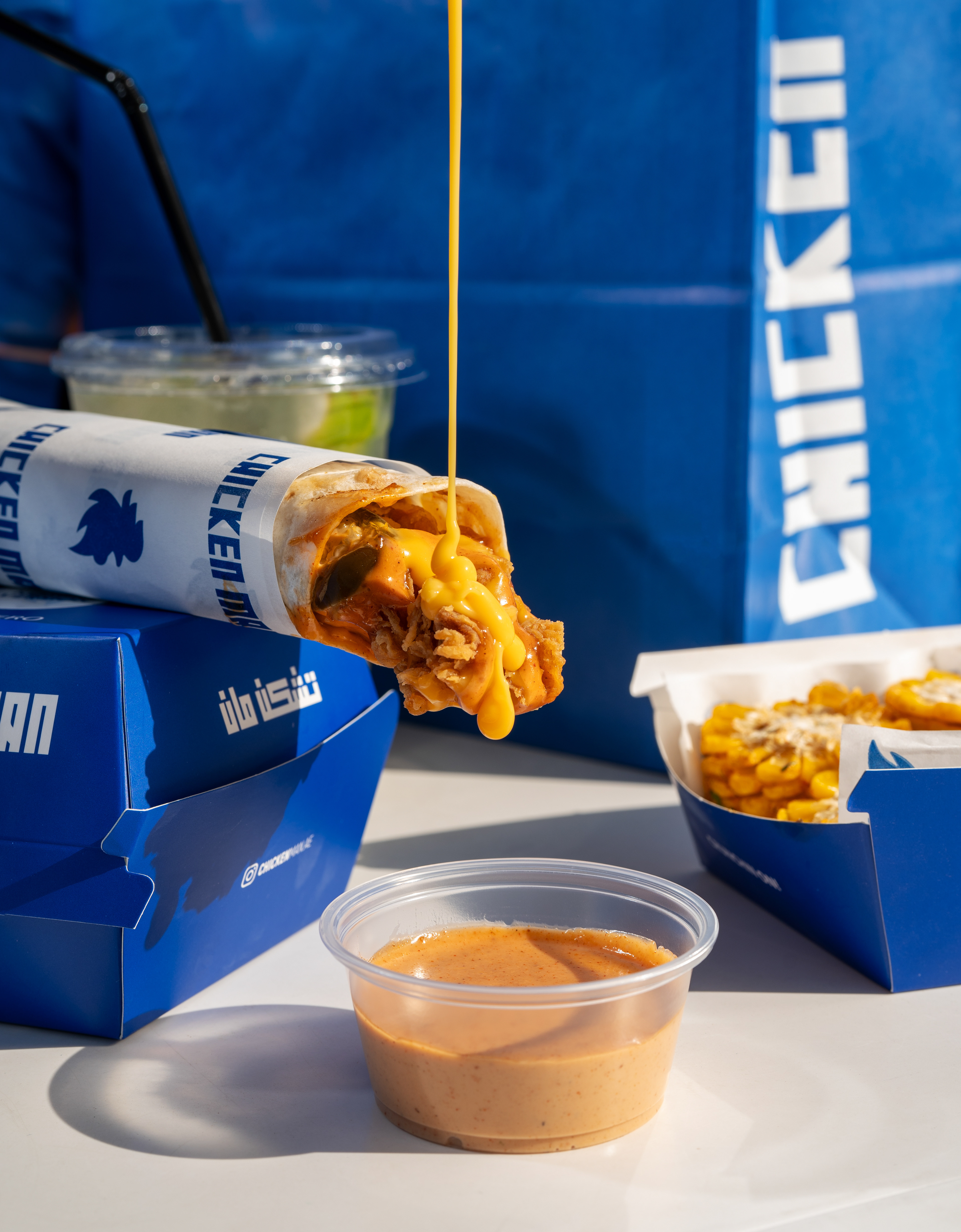
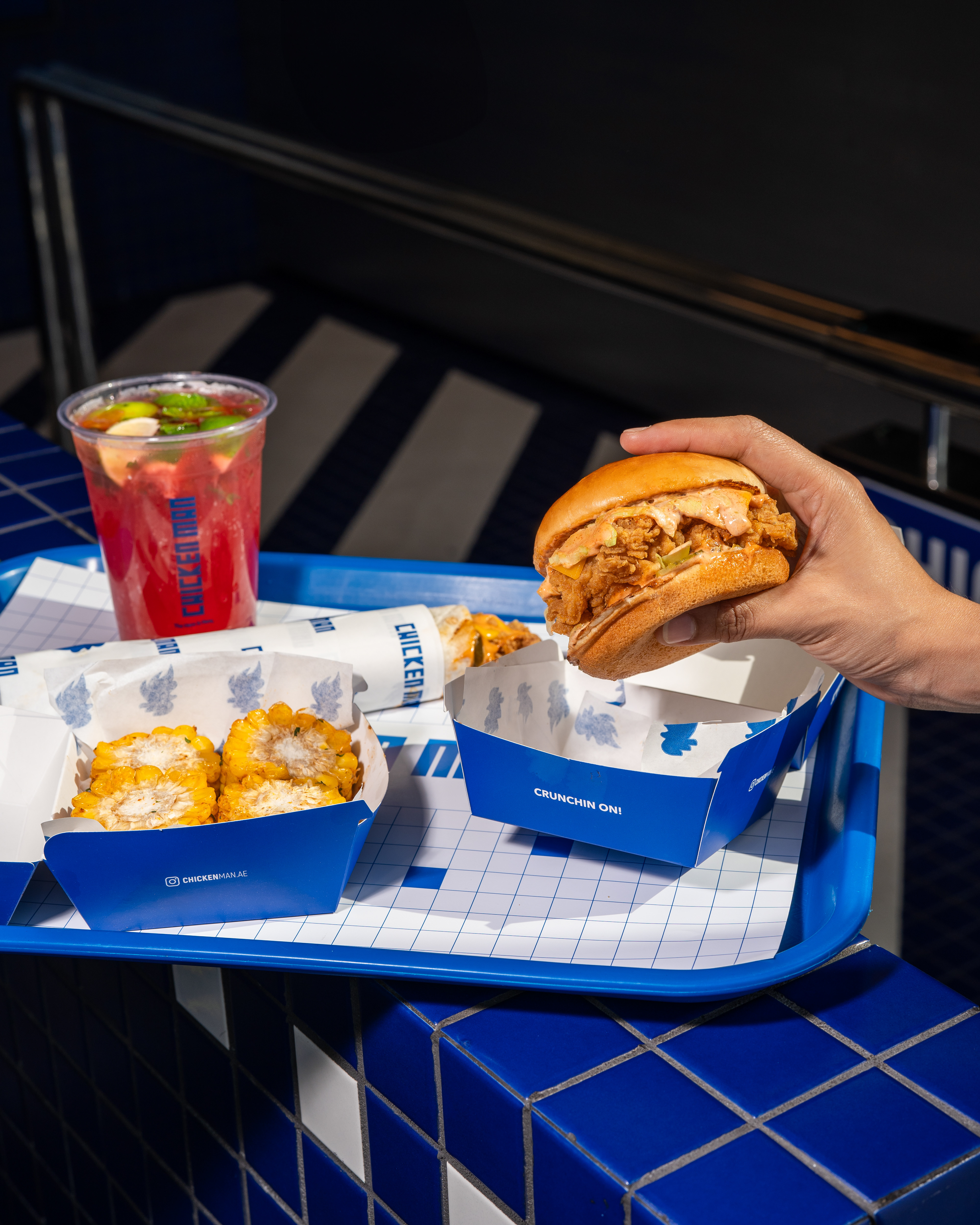
Packaging
The main objective of Chicken Man's rebranding is to revamp its image to resonate with the target audience of early teenagers and above, thereby advancing through the market, outperforming competitors, and gaining a competitive edge. The rebranding aims to attract a whole new market while maintaining its existing fan base. The focus will be on modernizing the brand, enhancing customer perceptions, and promoting the expanded dining options.
Collaboration Credit:
Interior design: WEFT, Kw.
Photography and Videography: Social Studio, UAE.